CSS 常用技巧

概述
相信大家在写css属性的时候,会遇到一些问题,比如说:垂直对齐,垂直居中,背景渐变动画,表格宽度自适应,模糊文本,样式重置,清除浮动,通用媒体查询,自定义选择文本,强制出现滚动条,固定头部和页脚,自己在网上看到的一篇关于css的文章,感觉这里边一些常用的css代码片段对大家很有帮助,所以我就把这篇文章分享给大家,希望大家能够喜欢。
css代码片段
1、垂直对齐
如果你用CSS,则你会有困惑:我该怎么垂直对齐容器中的元素?现在,利用CSS3的Transform,可以很优雅的解决这个困惑:
 体验AI代码助手复制代码.verticalcenter{
    position: relative;
    top: 50%;
    -webkit-transform: translateY(-50%);
    -o-transform: translateY(-50%);
    transform: translateY(-50%);
}使用这个技巧,从单行文本、段落到box,都会垂直对齐。目前浏览器对Transform的支持是需要关注的,
Chrome 4, Opera 10, Safari 3, Firefox 3, and Internet Explorer 9均支持该属性
2、伸展一个元素到窗口高度
在具体场景中,你可能想要将一个元素伸展到窗口高度,基本元素的调整只能调整容器的大小,因此要使一个元素伸展到窗口高度,我们需要伸展顶层元素:html和body:
 体验AI代码助手复制代码html,
body {
    height: 100%;
}然后将100%应用到任何元素的高
 体验AI代码助手复制代码div {
    height: 100%;
}
3、基于文件格式使用不同的样式
为了更容易知道链接的目标,有时你想让一些链接看起来和其它的不同。下面的片段在文本链接前添加一个图标,对不同的资源使用不同的图标或图片:
 体验AI代码助手复制代码a[href^="http://"]{
    padding-right: 20px;
    background: url(external.gif) no-repeat center right;
}
/* emails */
a[href^="mailto:"]{
    padding-right: 20px;
    background: url(email.png) no-repeat center right;
}

/* pdfs */
a[href$=".pdf"]{
    padding-right: 20px;
    background: url(pdf.png) no-repeat center right;
}
4、背景渐变动画
CSS中最具诱惑的一个功能是能添加动画效果,除了渐变,你可以给背景色、透明度、元素大小添加动画。目前,你不能为渐变添加动画,但下面的代码可能有帮助。它通过改变背景位置,让它看起来有动画效果。
 体验AI代码助手复制代码button {
    background-image: linear-gradient(#5187c4, #1c2f45);
    background-size: auto 200%;
    background-position: 0 100%;
    transition: background-position 0.5s;
}
button:hover {
    background-position: 0 0;
}
5、CSS:表格列宽自适用
对于表格,当谈到调整列宽时,是比较痛苦的。然后,这里有一个可以使用的技巧:给td元素添加white-space: nowrap;能让文本正确的换行
 体验AI代码助手复制代码td {
    white-space: nowrap;
}
6、只在一边或两边显示盒子阴影
如果你要一个盒阴影,试试这个技巧,能为任一边添加阴影。为了实现这个,首先定义一个有具体宽高的盒子,然后正确定位:after伪类。实现底边阴影的代码如下
体验AI代码助手复制代码.box-shadow {
background-color: #FF8020;
width: 160px;
height: 90px;
margin-top: -45px;
margin-left: -80px;
position: absolute;
top: 50%;
left: 50%;
}
.box-shadow:after {
content: "";
width: 150px;
height: 1px;
margin-top: 88px;
margin-left: -75px;
display: block;
position: absolute;
left: 50%;
z-index: -1;
-webkit-box-shadow: 0px 0px 8px 2px #000000;
-moz-box-shadow: 0px 0px 8px 2px #000000;
box-shadow: 0px 0px 8px 2px #000000;
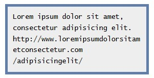
}7、包裹长文本
如果你碰到一个比自身容器长的文本,这个技巧对你很有用。在这个示例中,默认时,不管容器的宽度,文本都将水平填充。
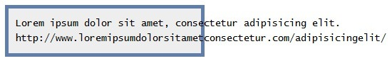
简单的CSS代码就能在容器中调整文本:
 体验AI代码助手复制代码pre {
    white-space: pre-line;
    word-wrap: break-word;
}
效果看起来如下:
8、制造模糊文本
想要让文本模糊?可以使用color透明和text-shadow实现
 体验AI代码助手复制代码.blurry-text {
   color: transparent;
   text-shadow: 0 0 5px rgba(0,0,0,0.5);
}
9、用CSS动画实现省略号动画
这个片段将帮助你制造一个ellipsis的动画,对于简单的加载状态是很有用的,而不用去使用gif图像。
 体验AI代码助手复制代码.loading:after {
    overflow: hidden;
    display: inline-block;
    vertical-align: bottom;
    animation: ellipsis 2s infinite;
    content: "\2026"; /* ascii code for the ellipsis character */
}
@keyframes ellipsis {
    from {
        width: 2px;
    }
    to {
        width: 15px;
    }
}
10、样式重置
 体验AI代码助手复制代码html, body, div, span, applet, object, iframe, h1, h2, h3, h4, h5, h6, p, blockquote, pre, a, abbr, acronym, address, big, cite, code, del, dfn, em, img, ins, kbd, q, s, samp, small, strike, strong, sub, sup, tt, var, b, u, i, center, dl, dt, dd, ol, ul, li, fieldset, form, label, legend, table, caption, tbody, tfoot, thead, tr, th, td, article, aside, canvas, details, embed, figure, figcaption, footer, header, hgroup, menu, nav, output, ruby, section, summary, time, mark, audio, video {
  margin: 0;
  padding: 0;
  border: 0;
  font-size: 100%;
  font: inherit;
  vertical-align: baseline;
  outline: none;
  -webkit-box-sizing: border-box;
  -moz-box-sizing: border-box;
  box-sizing: border-box;
}
html { height: 101%; }
body { font-size: 62.5%; line-height: 1; font-family: Arial, Tahoma, sans-serif; }
article, aside, details, figcaption, figure, footer, header, hgroup, menu, nav, section { display: block; }
ol, ul { list-style: none; }
blockquote, q { quotes: none; }
blockquote:before, blockquote:after, q:before, q:after { content: ''; content: none; }
strong { font-weight: bold; }
table { border-collapse: collapse; border-spacing: 0; }
img { border: 0; max-width: 100%; }
p { font-size: 1.2em; line-height: 1.0em; color: #333; }
11、典型的CSS清除浮动
 体验AI代码助手复制代码.clearfix:after {
 content: ".";
 display: block;
 clear: both;
 visibility: hidden;
 line-height: 0;
 height: 0;
}
.clearfix { display: inline-block; }
html[xmlns] .clearfix { display: block; }
* html .clearfix { height: 1%; }
12、新版清除浮动(2011)
 体验AI代码助手复制代码.clearfix:before, .container:after { content: ""; display: table; }
.clearfix:after { clear: both; }
/* IE 6/7 */
.clearfix { zoom: 1; }
13、跨浏览器的透明
 体验AI代码助手复制代码.transparent {
    filter: alpha(opacity=50); /* internet explorer */
    -khtml-opacity: 0.5;      /* khtml, old safari */
    -moz-opacity: 0.5;       /* mozilla, netscape */
    opacity: 0.5;           /* fx, safari, opera */
}
14、通用媒体查询
 体验AI代码助手复制代码/* Smartphones (portrait and landscape) ----------- */
@media only screen
and (min-device-width : 320px) and (max-device-width : 480px) {
  /* Styles */
}
/* Smartphones (landscape) ----------- */
@media only screen and (min-width : 321px) {
  /* Styles */
}
/* Smartphones (portrait) ----------- */
@media only screen and (max-width : 320px) {
  /* Styles */
}
/* iPads (portrait and landscape) ----------- */
@media only screen and (min-device-width : 768px) and (max-device-width : 1024px) {
  /* Styles */
}
/* iPads (landscape) ----------- */
@media only screen and (min-device-width : 768px) and (max-device-width : 1024px) and (orientation : landscape) {
  /* Styles */
}
/* iPads (portrait) ----------- */
@media only screen and (min-device-width : 768px) and (max-device-width : 1024px) and (orientation : portrait) {
  /* Styles */
}
/* Desktops and laptops ----------- */
@media only screen and (min-width : 1224px) {
  /* Styles */
}
/* Large screens ----------- */
@media only screen and (min-width : 1824px) {
  /* Styles */
}
/* iPhone 4 ----------- */
@media only screen and (-webkit-min-device-pixel-ratio:1.5), only screen and (min-device-pixel-ratio:1.5) {
  /* Styles */
}
15、自定义文本选择
 体验AI代码助手复制代码::selection { background: #e2eae2; }
::-moz-selection { background: #e2eae2; }
::-webkit-selection { background: #e2eae2; }
16、为logo隐藏H1
 体验AI代码助手复制代码h1 {
    text-indent: -9999px;
    margin: 0 auto;
    width: 320px;
    height: 85px;
    background: transparent url("images/logo.png") no-repeat scroll;
}
17、锚链接伪类
 体验AI代码助手复制代码a:link { color: blue; }
a:visited { color: purple; }
a:hover { color: red; }
a:active { color: yellow; }
18、CSS3:全屏背景
 体验AI代码助手复制代码html {
    background: url('images/bg.jpg') no-repeat center center fixed;
    -webkit-background-size: cover;
    -moz-background-size: cover;
    -o-background-size: cover;
    background-size: cover;
}
19、内容垂直居中
 体验AI代码助手复制代码.container {
    min-height: 6.5em;
    display: table-cell;
    vertical-align: middle;
}
20、强制出现垂直滚动条
体验AI代码助手复制代码html { height: 101% }21、CSS3渐变模板
 体验AI代码助手复制代码#colorbox {
    background: #629721;
    background-image: -webkit-gradient(linear, left top, left bottom, from(#83b842), to(#629721));
    background-image: -webkit-linear-gradient(top, #83b842, #629721);
    background-image: -moz-linear-gradient(top, #83b842, #629721);
    background-image: -ms-linear-gradient(top, #83b842, #629721);
    background-image: -o-linear-gradient(top, #83b842, #629721);
    background-image: linear-gradient(top, #83b842, #629721);
}
22、CSS3 斑马线
 体验AI代码助手复制代码tbody tr:nth-child(odd) {
    background-color: #ccc;
}
23、内部CSS3 盒阴影
 体验AI代码助手复制代码#mydiv {
    -moz-box-shadow: inset 2px 0 4px #000;
    -webkit-box-shadow: inset 2px 0 4px #000;
    box-shadow: inset 2px 0 4px #000;
}
24、外部CSS3 盒阴影
 体验AI代码助手复制代码#mydiv {
    -webkit-box-shadow: 0 2px 2px -2px rgba(0, 0, 0, 0.52);
    -moz-box-shadow: 0 2px 2px -2px rgba(0, 0, 0, 0.52);
    box-shadow: 0 2px 2px -2px rgba(0, 0, 0, 0.52);
}
25、三角形列表项目符号
 体验AI代码助手复制代码ul {
    margin: 0.75em 0;
    padding: 0 1em;
    list-style: none;
}
li:before {
    content: "";
    border-color: transparent #111;
    border-style: solid;
    border-width: 0.35em 0 0.35em 0.45em;
    display: block;
    height: 0;
    width: 0;
    left: -1em;
    top: 0.9em;
    position: relative;
}
26、固定宽度的居中布局
 体验AI代码助手复制代码#page-wrap {
    width: 800px;
    margin: 0 auto;
}
27、CSS3 列文本
 体验AI代码助手复制代码#columns-3 {
    text-align: justify;
    -moz-column-count: 3;
    -moz-column-gap: 12px;
    -moz-column-rule: 1px solid #c4c8cc;
    -webkit-column-count: 3;
    -webkit-column-gap: 12px;
    -webkit-column-rule: 1px solid #c4c8cc;
}
28、CSS固定页脚
 体验AI代码助手复制代码#footer {
    position: fixed;
    left: 0px;
    bottom: 0px;
    height: 30px;
    width: 100%;
    background: #444;
}
/* IE 6 */
* html #footer {
    position: absolute;
    top: expression((0-(footer.offsetHeight)+(document.documentElement.clientHeight ? document.documentElement.clientHeight : document.body.clientHeight)+(ignoreMe = document.documentElement.scrollTop ? document.documentElement.scrollTop : document.body.scrollTop))+'px');
}
29、跨浏览器设置最小高度
 体验AI代码助手复制代码#container {
    min-height: 550px;
    height: auto !important;
    height: 550px;
}
30、CSS3 鲜艳的输入
 体验AI代码助手复制代码input[type=text], textarea {
    -webkit-transition: all 0.30s ease-in-out;
    -moz-transition: all 0.30s ease-in-out;
    -ms-transition: all 0.30s ease-in-out;
    -o-transition: all 0.30s ease-in-out;
    outline: none;
    padding: 3px 0px 3px 3px;
    margin: 5px 1px 3px 0px;
    border: 1px solid #ddd;
}
input[type=text]:focus, textarea:focus {
    box-shadow: 0 0 5px rgba(81, 203, 238, 1);
    padding: 3px 0px 3px 3px;
    margin: 5px 1px 3px 0px;
    border: 1px solid rgba(81, 203, 238, 1);
}
31、基于文件类型的链接样式
 体验AI代码助手复制代码/* external links */
a[href^="http://"] {
    padding-right: 13px;
    background: url('external.gif') no-repeat center right;
}
/* emails */
a[href^="mailto:"] {
    padding-right: 20px;
    background: url('email.png') no-repeat center right;
}
/* pdfs */
a[href$=".pdf"] {
    padding-right: 18px;
    background: url('acrobat.png') no-repeat center right;
}
32、强制换行
 体验AI代码助手复制代码pre {
    white-space: pre-wrap;       /* css-3 */
    white-space: -moz-pre-wrap;  /* Mozilla, since 1999 */
    white-space: -pre-wrap;      /* Opera 4-6 */
    white-space: -o-pre-wrap;    /* Opera 7 */
    word-wrap: break-word;       /* Internet Explorer 5.5+ */
}
33、在可点击的项目上强制手型
 体验AI代码助手复制代码a[href], input[type='submit'], input[type='image'], label[for], select, button, .pointer {
    cursor: pointer;
}
34、CSS3对话气泡
 体验AI代码助手复制代码.chat-bubble {
    background-color: #ededed;
    border: 2px solid #666;
    font-size: 35px;
    line-height: 1.3em;
    margin: 10px auto;
    padding: 10px;
    position: relative;
    text-align: center;
    width: 300px;
    -moz-border-radius: 20px;
    -webkit-border-radius: 20px;
    -moz-box-shadow: 0 0 5px #888;
    -webkit-box-shadow: 0 0 5px #888;
    font-family: 'Bangers', arial, serif;
}
.chat-bubble-arrow-border {
    border-color: #666 transparent transparent transparent;
    border-style: solid;
    border-width: 20px;
    height: 0;
    width: 0;
    position: absolute;
    bottom: -42px;
    left: 30px;
}
.chat-bubble-arrow {
    border-color: #ededed transparent transparent transparent;
    border-style: solid;
    border-width: 20px;
    height: 0;
    width: 0;
    position: absolute;
    bottom: -39px;
    left: 30px;
}
35、H1-H5默认样式
 体验AI代码助手复制代码h1,h2,h3,h4,h5{
    color: #005a9c;
}
h1{
    font-size: 2.6em;
    line-height: 2.45em;
}
h2{
    font-size: 2.1em;
    line-height: 1.9em;
}
h3{
    font-size: 1.8em;
    line-height: 1.65em;
}
h4{
    font-size: 1.65em;
    line-height: 1.4em;
}
h5{
    font-size: 1.4em;
    line-height: 1.25em;
}
36、CSS悬浮提示文本
 体验AI代码助手复制代码a {
    border-bottom:1px solid #bbb;
    color:#666;
    display:inline-block;
    position:relative;
    text-decoration:none;
}
a:hover,
a:focus {
    color:#36c;
}
a:active {
    top:1px;
}
/* Tooltip styling */
a[data-tooltip]:after {
    border-top: 8px solid #222;
    border-top: 8px solid hsla(0,0%,0%,.85);
    border-left: 8px solid transparent;
    border-right: 8px solid transparent;
    content: "";
    display: none;
    height: 0;
    width: 0;
    left: 25%;
    position: absolute;
}
a[data-tooltip]:before {
    background: #222;
    background: hsla(0,0%,0%,.85);
    color: #f6f6f6;
    content: attr(data-tooltip);
    display: none;
    font-family: sans-serif;
    font-size: 14px;
    height: 32px;
    left: 0;
    line-height: 32px;
    padding: 0 15px;
    position: absolute;
    text-shadow: 0 1px 1px hsla(0,0%,0%,1);
    white-space: nowrap;
    -webkit-border-radius: 5px;
    -moz-border-radius: 5px;
    -o-border-radius: 5px;
    border-radius: 5px;
}
a[data-tooltip]:hover:after {
    display: block;
    top: -9px;
}
a[data-tooltip]:hover:before {
    display: block;
    top: -41px;
}
a[data-tooltip]:active:after {
    top: -10px;
}
a[data-tooltip]:active:before {
    top: -42px;
}
37、深灰色的圆形按钮
 体验AI代码助手复制代码.graybtn {
    -moz-box-shadow:inset 0px 1px 0px 0px #ffffff;
    -webkit-box-shadow:inset 0px 1px 0px 0px #ffffff;
    box-shadow:inset 0px 1px 0px 0px #ffffff;
    background:-webkit-gradient( linear, left top, left bottom, color-stop(0.05, #ffffff), color-stop(1, #d1d1d1) );
    background:-moz-linear-gradient( center top, #ffffff 5%, #d1d1d1 100% );
    filter:progid:DXImageTransform.Microsoft.gradient(startColorstr='#ffffff', endColorstr='#d1d1d1');
    background-color:#ffffff;
    -moz-border-radius:6px;
    -webkit-border-radius:6px;
    border-radius:6px;
    border:1px solid #dcdcdc;
    display:inline-block;
    color:#777777;
    font-family:arial;
    font-size:15px;
    font-weight:bold;
    padding:6px 24px;
    text-decoration:none;
    text-shadow:1px 1px 0px #ffffff;
}
.graybtn:hover {
    background:-webkit-gradient( linear, left top, left bottom, color-stop(0.05, #d1d1d1), color-stop(1, #ffffff) );
    background:-moz-linear-gradient( center top, #d1d1d1 5%, #ffffff 100% );
    filter:progid:DXImageTransform.Microsoft.gradient(startColorstr='#d1d1d1', endColorstr='#ffffff');
    background-color:#d1d1d1;
}
.graybtn:active {
    position:relative;
    top:1px;
}
38、在可打印的网页中显示URLs
 体验AI代码助手复制代码@media print   {
  a:after {
    content: " [" attr(href) "] ";
  }
}
53、禁用移动Webkit的选择高亮
 体验AI代码助手复制代码body {
    -webkit-touch-callout: none;
    -webkit-user-select: none;
    -khtml-user-select: none;
    -moz-user-select: none;
    -ms-user-select: none;
    user-select: none;
}
39、CSS3 圆点图案
 体验AI代码助手复制代码body {
    background: radial-gradient(circle, white 10%, transparent 10%),
    radial-gradient(circle, white 10%, black 10%) 50px 50px;
    background-size: 100px 100px;
}
40、CSS font属性缩写
 体验AI代码助手复制代码p {
  font: italic small-caps bold 1.2em/1.0em Arial, Tahoma, Helvetica;
}
41、论文页面的卷曲效果
 体验AI代码助手复制代码ul.box {
    position: relative;
    z-index: 1; /* prevent shadows falling behind containers with backgrounds */
    overflow: hidden;
    list-style: none;
    margin: 0;
    padding: 0;
}
ul.box li {
    position: relative;
    float: left;
    width: 250px;
    height: 150px;
    padding: 0;
    border: 1px solid #efefef;
    margin: 0 30px 30px 0;
    background: #fff;
    -webkit-box-shadow: 0 1px 4px rgba(0, 0, 0, 0.27), 0 0 40px rgba(0, 0, 0, 0.06) inset;
    -moz-box-shadow: 0 1px 4px rgba(0, 0, 0, 0.27), 0 0 40px rgba(0, 0, 0, 0.06) inset;
    box-shadow: 0 1px 4px rgba(0, 0, 0, 0.27), 0 0 40px rgba(0, 0, 0, 0.06) inset;
}
ul.box li:before,
ul.box li:after {
    content: '';
    z-index: -1;
    position: absolute;
    left: 10px;
    bottom: 10px;
    width: 70%;
    max-width: 300px; /* avoid rotation causing ugly appearance at large container widths */
    max-height: 100px;
    height: 55%;
    -webkit-box-shadow: 0 8px 16px rgba(0, 0, 0, 0.3);
    -moz-box-shadow: 0 8px 16px rgba(0, 0, 0, 0.3);
    box-shadow: 0 8px 16px rgba(0, 0, 0, 0.3);
    -webkit-transform: skew(-15deg) rotate(-6deg);
    -moz-transform: skew(-15deg) rotate(-6deg);
    -ms-transform: skew(-15deg) rotate(-6deg);
    -o-transform: skew(-15deg) rotate(-6deg);
    transform: skew(-15deg) rotate(-6deg);
}
ul.box li:after {
    left: auto;
    right: 10px;
    -webkit-transform: skew(15deg) rotate(6deg);
    -moz-transform: skew(15deg) rotate(6deg);
    -ms-transform: skew(15deg) rotate(6deg);
    -o-transform: skew(15deg) rotate(6deg);
    transform: skew(15deg) rotate(6deg);
}
42、鲜艳的锚链接
 体验AI代码助手复制代码a {
    color: #00e;
}
a:visited {
    color: #551a8b;
}
a:hover {
    color: #06e;
}
a:focus {
    outline: thin dotted;
}
a:hover, a:active {
    outline: 0;
}
a, a:visited, a:active {
    text-decoration: none;
    color: #fff;
    -webkit-transition: all .3s ease-in-out;
}
a:hover, .glow {
    color: #ff0;
    text-shadow: 0 0 10px #ff0;
} 相关文章
广告赞助

热门文章
-
⛳前端进阶:SEO 全方位解决方案
2023-06-07 -

Claude Code完全指南:2025年最强AI编程助手深度评测
2025-06-06 -

提升前端SEO的技巧与方法
2024-08-04 -

别再吹通用型Al Agent了!其实真实业务都是Workflow
2025-04-28 -
Trae Pro 付费版来啦!🤔 你会掏钱吗?
2025-03-15 -
OCR识别常见的八大开源工具
2023-07-31 -

Vue 3.4 发布
2023-12-29 -
AI - 发现一个超级好用的 AI 聚合平台
2024-06-10
有话要说...